Self-Branding
Logo design
Visual Identity, Brand Storytelling, Design Concept
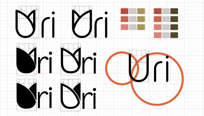
I designed my logo based on my personal goals and personality. I’m passionate about brightening someone’s day by creating meaningful connections through design.
The Story
For the ‘Uri’ logo, I incorporated three key concepts that represent me. The letter ‘U’ is shaped like a tulip, a flower that symbolizes spring, warmth, and joy—values that reflect my approach to design. Tulips are also a symbol of gratitude, which aligns with my attitude toward people, work, and the environment. I believe in appreciating everything first, as understanding and respect form the foundation of meaningful connections.
Additionally, tulips come in various colors, representing versatility. I strive to be a designer who can adapt, offering diverse perspectives, solutions, and creative possibilities.
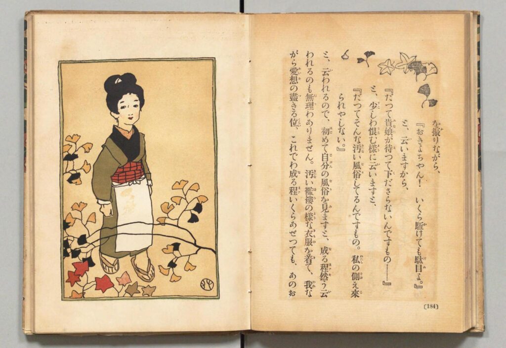
The color palette reflects my Japanese identity, inspired by traditional Japanese illustrations, with soft hues reminiscent of tulips.
Source: National Diet Library, Japan – NDL Image Bank (https://ndlsearch.ndl.go.jp/imagebank)