Laneway Pantry
Interactive Impact Report
UI/UX Design, Data Visualization, Digital Storytelling, Brand Identity, Social Impact
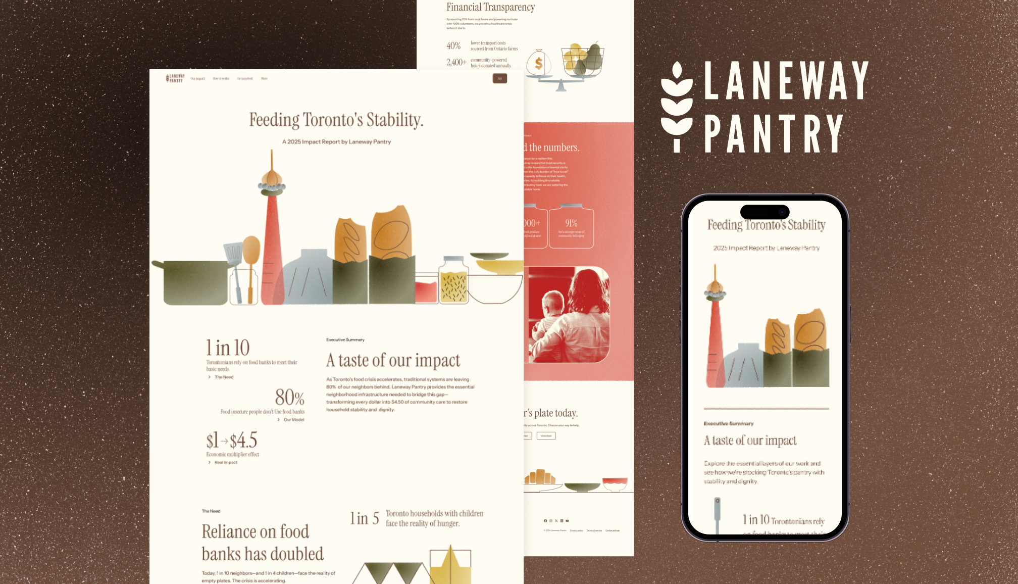
This project transforms a traditional, static PDF impact report into an immersive, mobile-first scrollytelling experience for Laneway Pantry, a Toronto-based social enterprise. By blending “Tactile Geometric Minimalism” with robust data journalism, the report justifies the organization’s structural necessity, helps renew grants, and attracts grocery partners while honoring the dignity of the community it serves.
Key Objectives
- Modernize Digital Reporting: Replace static documentation with an interactive narrative that keeps “time-poor” stakeholders engaged through dynamic data visualization.
- Localize the Narrative: Ground the visual identity in Toronto’s unique urban fabric—specifically its historic laneways and “Bay and Gable” architecture—to build immediate trust with municipal funders.
- Humanize Data through Design: Bridge the gap between cold statistics and human stories, proving that food security is a structural foundation for household stability and dignity.
Target Audience
- Primary Audience: Institutional funders and municipal program officers (ages 30–60) who require evidence-driven results but have limited time to digest long-form reports.
- Secondary Audience: Grocery and logistics partners (ages 28–55) looking for efficient, transparent, and brand-aware operational models to support.
Design Approach/Strategies
- Visual Identity (Tactile Geometric Minimalism): Simple geometric shapes distill the essential nature of food security into clean visual form — deliberately restrained rather than overworked, in keeping with the value of a social enterprise. To avoid a cold, digital feel, a Risograph grain texture and organic edges were applied throughout, giving the report a grounded, honest, and fiscally responsible character.
- Localizing the Brand: The logo uses a customized League Gothic, a revival of historic 20th-century Toronto signage, to evoke stability and heritage. This is paired with locally grounded illustrations: skyline composed from food elements and “Bay-and-Gable” style housing that anchor the Laneway identity within its Toronto context.
- Tone and Messaging: The tone is professional, transparent, and empathetic. Editorial-style photography — focusing on textures and scene rather than faces — works alongside clear data visualization to build a cohesive narrative. Together, these create a visual language designed to move audiences to act in support of their neighbours.